Design System
The Why of a Design System
The component-based development has since its introduction in the year 1968 continuously won importance for the design of interactive systems. The separation of applications into reusable components, increases speed and reduces effort by requiring as little code as possible to be reprogrammed or even reprogrammed several times.
Over the past 50 years, we have learned to handle the field of components. In the meantime, there are various standards that contribute to the production of reusable components with consistently high quality for a wide variety of applications.
Furthermore, even with ever-growing applications and decentralized teams, the goal is to create a consistent user experience.
Debt trap random principle
The number of autonomously acting teams, unequal tools and a changing functional density represent a challenge for the creation of a coherent appearance.
Decisions about e.g. arrangement, visibility or behaviour have so far been made individually along the current problem. Each requirement was taken in isolation and solved exclusively for the respective context. The abundance of conflicting design decisions paired with insufficient specifications caused irregular user interfaces (UI) and random conventions.
Customized design is slow, inconsistent, and difficult to maintain.
The permanent inconsistency leads further and further into the debt trap. The number of design debts grows with each individual customized solution, making the maintenance of the entire application even more difficult. Establishing a consistent UI design across platforms as well as teams becomes an almost impossible challenge.
Common understanding
How can design and the related decisions be scaled? Blindly strengthening the design team to make more decisions faster seems to be a counter-productive method in this case. Custom design can only be reproduced to a limited level (if at all).
It would be more important to think about how solutions can be developed faster and more efficiently, which work in the same way for various problems.
In order to make design scalable, it is not enough to reduce technical effort by using only reusable components. The technical perspective must be supported by a semantic order (design language) in order to complete the previously fragmented designs into a common UX result.
Without a common design language, solutions will remain individual and inconsistent.
A design system forms the alliance between described standards and reusable components. By specifying, for example, purpose, shape, place, color, or movement, a component has additional (important) properties that allow it to work consistently across the entire range. For the different teams, the system serves as an integrated reference and a well-founded basis for their own decisions. The involved teams as well as the design of the applications can be synchronized via this instrument.
| Fragmented | Systematic |
|---|---|
| Consistent user experience not possible | Keeps teams and applications synchronized |
| There are too many truths to solve a problem | Recurring patterns make easy to understand applications |
| Lack of conventions results in different surfaces | Prototyping is professionalized and made easier |
| Design process collapses | Design debts become more controllable and minimized |
In addition, the link between established conventions and repeating UI elements creates an easy-to-understand application for users, which not only has a positive impact on support efforts, but can also provide competitive advantages and retain existing customers.
Progress through movement
A design system is like an organism and must be maintained continuously. It is not a static structure, but constantly in motion while it regularly receives changes in the form of updates and optimizations. Instead of building up further design debts with individual solutions, new, creative approaches can flow back into the system and become centrally available. The decentralized teams and their applications benefit from the centralized work on the system, as they can expect to see their efforts decrease.
With the systematic use of design guidelines, combined with reusable components, creative solutions are arranged in a focused and sustainable manner for the design of interactive systems.
Reliable solutions receive a healthy kind of universality, while ensuring that the same problems are always solved the same way. The continuous team feedback modifies and optimizes the design system so that distributed applications can participate.
Theming Colors
Use Case
The default color scheme of the dialogs and interfaces should optimally incorporate the d.veop branding within the software without copying the current website or published print media. Furthermore, the color scheme should integrate excellently into known (leading) applications without being perceived as a disturbing factor.
Explanations
By using the following color values, we also move outside of red/green weaknesses and within fully-accepted contrasts regarding accessibility. In color psychology, the chosen colors stand for emotional values such as trust, honesty, responsibility and joy.
Colors
In addition to the existing default theme, there are other variants, such as the so-called dark theme or in the future a high-contrast theme for people with high visual impairment.
Default-Theme
| Description | Color Code |
|---|---|
| primary | HEX: #1f89c3 // RGB: 31,137,195 |
| on-primary | HEX: #ffffff // RGB: 255,255,255 |
| secondary | HEX: #333e48 // RGB: 51,62,72 |
| on-secondary | HEX: #ffffff// RGB: 255,255,255 |
| surface | HEX: #ffffff // RGB: 255,255,255 |
| on-surface | HEX: #00000 // RGB: 0,0,0 |
| background | HEX: #ffffff // RGB: 255,255,255 |
State Colors
| Description | Color Code |
|---|---|
| error | HEX: #b00020 // RGB: 176,0,32 |
| warning | HEX: #ffcb31 // RGB: 255,203,49 |
| success | HEX: #35b04b // RGB: 53,176,75 |
Dark-Theme
| Description | Color Code |
|---|---|
| primary | HEX: #86d4f1 // RGB: 134,212,241 |
| on-primary | HEX: #000000 // RGB: 0,0,0 |
| secondary | HEX: #8d9ba8 // RGB: 141,155,168 |
| on-secondary | HEX: #000000 // RGB: 0,0,0 |
| surface | HEX: #121212 // RGB: 18,18,18 |
| on-surface | HEX: #ffffff // RGB: 255,255,255 |
| background | HEX: #121212 // RGB: 18,18,18 |
State Colors
| Description | Color Code |
|---|---|
| error | HEX: #cf6679 // RGB: 207,102,121 |
| warning | HEX: #ffe085 // RGB: 255,224,133 |
| success | HEX: #85cf92 // RGB: 133,207,146 |
Helpful Links
You can find more information about this on the following pages of the Design System.
Buttons - Usage
Use Case
When displaying buttons on pages or dialogs, the individual actions should be weighted in order to inform the user of the various options. In addition, the primary action should be visually more distinguishable from the remaining options.
Explanations
The standard design system offers four different versions of buttons to direct the user's attention.
A single button should appear in the contained version with a filled area in the primary color. If two buttons exist next to each other, a so-called text button without borders or colored fill is used next to the contained version.
Particularity
Dialog actions are represented as textual buttons and allow the user to confirm or reject something.
Caution
The Floating Action Button (FAB) is an exception, and is not affected by this addition to the Design System. The FAB is floating above all other contents and should be accessible at all times. Typically as a circular shape with an icon in its center.
The FAB currently competes too much with the concept of context actions, so it is strongly recommended not to use them in order not to unnecessarily confuse the user.
Helpful Links
You can find more information about this on the following pages of the Design System.
Buttons - Placement
Use Case
The processing of content within a resource is to be completed. The user should be allowed to save the changes. Where should the corresponding action be placed?
Explanations
Actions that refer to the resource content should be part of the Top App Bar at the top of the resource as so-called icon buttons. The individual actions are added from left to right starting in the start area. Less important actions (considering the respective context) can be added to the end area of the Top App Bar.
Particularity
With classic web forms (e.g. registration or login), which are usually filled in from top to bottom, the primary actions are positioned right-justified below the last form element.
As soon as the form does exceed the visible area of the display, it is recommended to fix the actions at the bottom of the screen in order to be able to reach them without additional scrolling.
Caution
Even if the presentation of document properties should come very close to the appearance of a classic web form, the actions must be provided in the Top App Bar. Finally, in such cases a user often suspects the finishing action at the point where the initial action took place (Edit -> Save).
Helpful Links
You can find more information about this on the following pages of the Design System.
Text input fields - Usage
Use Case
Material Design offers a variety of input fields. The variants Filled and Outlined differ significantly in the way they are separated from each other. Filled is characterized by a background that stands out from the rest, while the outlined variety is defined by a closed stroke.
Explanations
Due to the visual proximity to paper-based form fields and the higher degree of differentiation compared to a button, the Filled variant is recommended and should be used as default.
Particularity
Outlined should only be used in exceptional cases, and only within a closed context. The deviation from the standard should serve a specific purpose, such as better differentiation or clarification of a foreign/new context. A mixed usage or change within the same usage situation is not permitted.
The intended use from the user's point of view is a reliable indicator of the correct usage of the two variants. If data (e.g. attributes) is to be changed for the purpose of modification, the filled variant is required. In other cases, such as to display the filter options using the values determined for a facet, the outlined variant is allowed.
For multi-line input using a text area, the Filled variant should also be used.
Caution
In contrast to the description, there are other variants within the Demo, such as Shaped Filled. This variant with strongly rounded upper corners should not be used.
Helpful Links
You can find more information about this on the following pages of the Design System.
Top App Bar - Usage
Use Case
There are different variants of the Top App Bar with the following features: Normal, Dense or Short. The differences of the three variants are mainly the height of the element. Which variant should be used?
Explanations
Within d.ecs shell, which is mainly responsible for the positioning of the individual app resources and the compliance with the underlying operating concept, the Top App Bar will also be used as an element. Essentially, d.ecs shell uses the normal form.
For use as a toolbar to offer actions within one's own resources, the slightly more sparing form (dense) should be used. In addition, the action bar should not appear in the primary color, but in the color of the background (usually white). These changes can be solved by assigning attributes to the relevant CSS classes or by using SCSS mixins. The positioning of the toolbar icons is adjusted to the icons of the shell-top app bar so that the icons are positioned one below the other. Please note that from a width of <= 600px the shell top app bar is also used in the dense variant and the distances to the right and left are reduced accordingly.
Details on style customizations of the Top App Bar are described here.
Particularity
The normal Top App Bar automatically reduces the height depending on the available space. In contrast to this the Dense variant is height-stable at all times.
It is often useful to be able to permanently fix the toolbar at the top so that the relevant actions remain accessible at all times. In this case the fixed version can be combined with the dense version. The behavior of the dense variant, on the other hand, is such that the toolbar disappears with the scroll movement, but reappears at the top of the screen at the first countermovement.
Caution
For the variants Short and Prominent we have not yet been able to identify any use case. These should not be used for the time being.
Helpful Links
You can find more information about this on the following pages of the Design System.
List - Advanced Item List with entries
Use Case
You need to create a list with entries for which you can perform different actions.
Explanations
The anatomy of a list entry allows up to two direct actions on the list element itself. The primary action area is located before the actual content, while the secondary follows the content area. The content can be single or multi-line (max. 3 lines).
A content hierarchy is displayed by the sequence, which represents the relevance from front to back. The primary action area is very often used as a leading identifier (e.g. pictogram or image). Within a multiline content area, the sequence also serves as an indicator of relevance (important = top).
Particularity
Checkboxes for the selection of an element can be both front (primary) and rear (secondary). The position of the checkbox depends strongly from the respective context. If the selection option is the only action for the element, the checkbox is leading. If the space for the primary action is already occupied (e.g. pictogram), the secondary area can also be used for the the checkbox.
Checkboxes must be clicked explicitly in order to be able to change their state. The confirmation of the entry itself has no effect on the selection state, unless this is the only option for the entire entry.
Material recommends an on mouse over-effect as an visual indicator for the selection of elements.
Caution
Two actions may not be displayed simultaneously side by side within an area (primary or secondary). In a desktop environment, checkboxes are preferable to switch controls, as they are commonly known from smartphones.
Helpful Links
You can find more information about this on the following pages of the Design System.
List - Move items accessible
Use Case
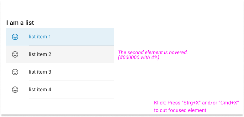
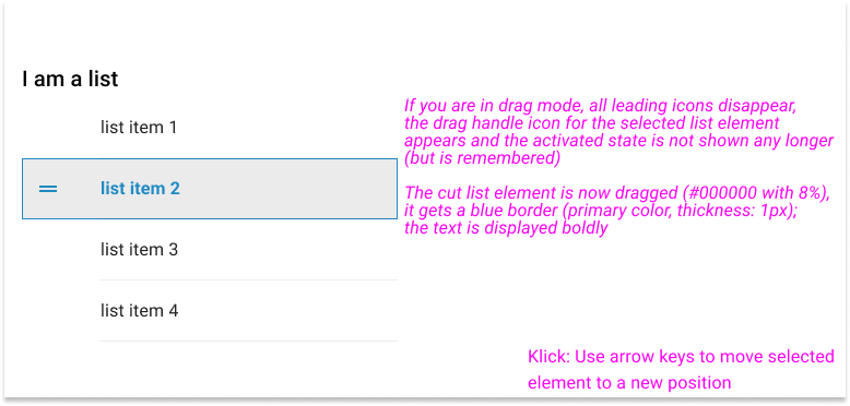
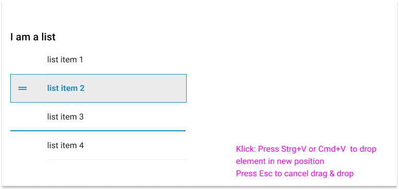
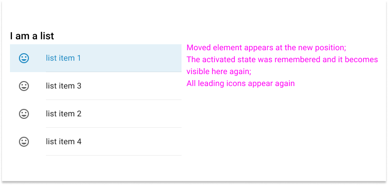
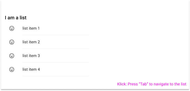
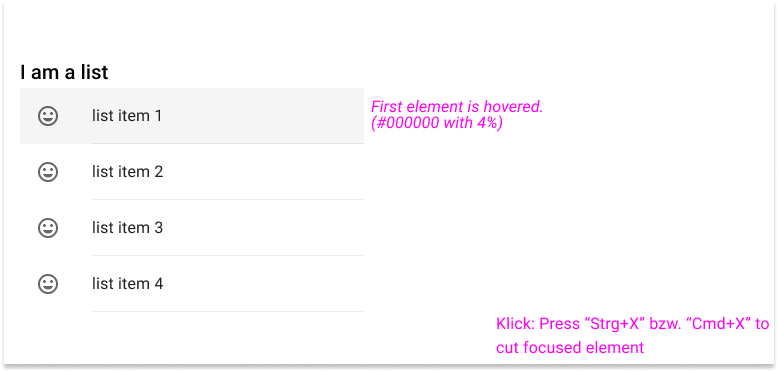
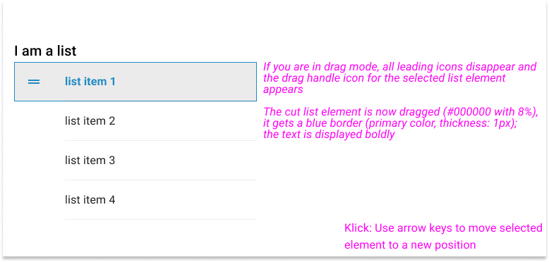
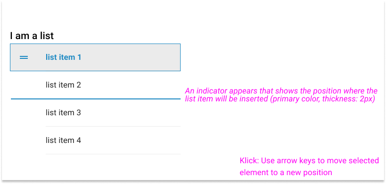
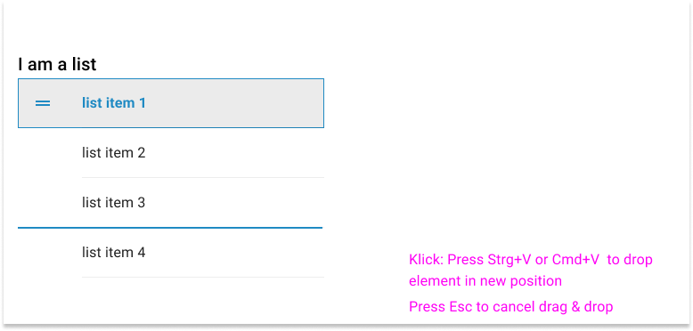
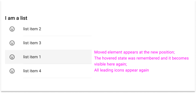
To rearrange and organize items, drag&drop via mouse control is mostly used. However, if you don't want to rely only on the mouse, the whole thing must also work with the help of the keyboard. But how can the user move a list item from A to B using only keyboard control?
Explanations
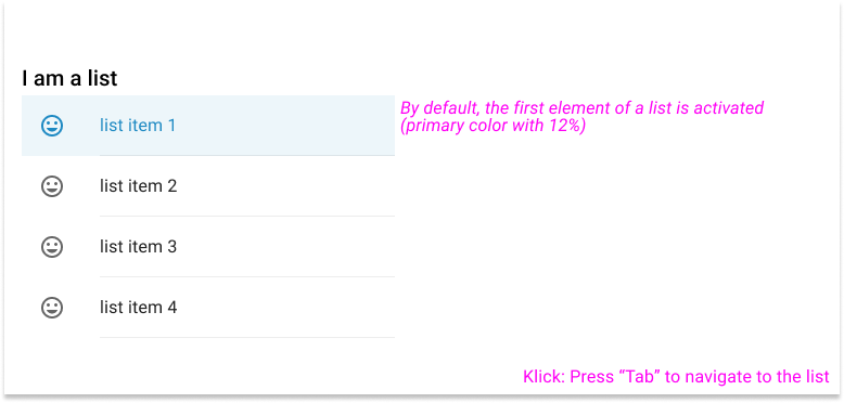
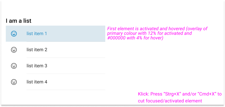
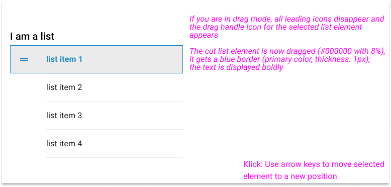
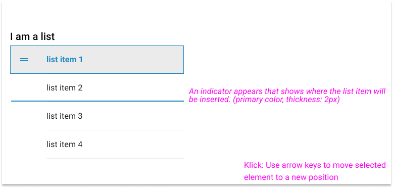
To move items via keyboard, the known key combinations for cut and paste are used: Strg+X/Cmd+X (Cut) and Strg+V/Cmd+V (Paste).
Scenarios
In the following, 3 scenarios are presented as examples:
Szenario 1
Initial situation: The first element of the list is activated. It is to be moved in the following.
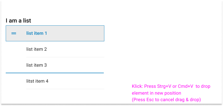
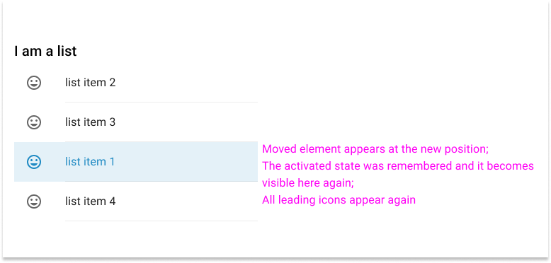
Scenario 2
Initial situation: The first element of the list is activated. In the following, the user navigates to the second element, which is then to be moved.
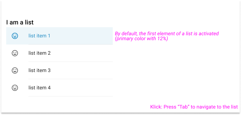
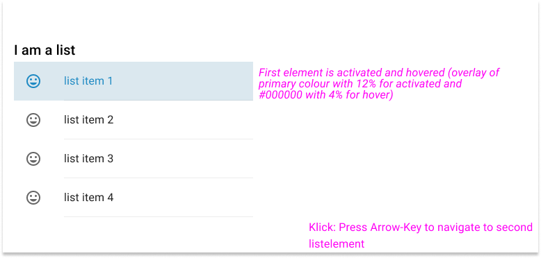
Scenario 3
Initial situation: No element is activated in the list. In the following, the first element is to be moved.
Links
You can find further content on the following pages:
Progress indicators - Usage
Use Case
Often operations not visible to the user (e.g. server communication) have to be performed in the background in order to display the user interface as required after receiving the data. Progress indicators exist to inform the user about an operation taking place in the background. The various indicators are used to express non-specifiable waiting times or the duration of a process.
Explanations
As soon as the system performs operations in the background (not visible), users should be informed in a timely manner and by appropriate feedback during their usage. According to psychological findings, people expect a reaction from their interaction partners within 192 ms to what they have said. The same expectation applies to working with an interactive system, such as the user interface of an application.
For this reason, and to avoid potential unintended situations (e.g. by performing the same action more than once), the system should signal ongoing activities to the user in a reasonable (time) frame. If it can be assumed that the actual duration of the waiting time cannot be determined more precisely, the indicator type "Indeterminate" with the form factor "linear" is recommended.
If possible, it is strongly recommended to describe the current situation with a short, precise description above the indicator (e.g. "Changes are saved...").
Particularity
If it concerns the initial layout of a table, the linear indicator runs along the lower edge of the table header. If the table header is outside the visible area, the indicator moves along the bottom edge of the last visible table row.
Caution
The circular indicator type is only to be used if a longer lasting (background) activity is to be signalled on an element which, due to its physical nature (e.g. a button) does not allow any other variant.
Helpful Links
You can find more information about this on the following pages of the Design System.
Selection Controls - Color
Use Case
Within a dialog it is possible to use different elements (e.g. checkboxes or radio buttons) to choose between various values.
Explanations
Material Design allows primary and secondary color coding for the above-mentioned selection elements. For a consistent appearance, it is necessary to define a default appearance.
Since the secondary color is already recommended by the design system for color styling, this is set as the default type of appearance for selection control elements.
Helpful Links
You can find more information about this on the following pages of the Design System.
Applying color to selection controls
Error dialogs - Guidelines for designing
Use Case
Application errors may occur regardless of user input.
Explanations
If errors occur independently of entries in a text field, the user should receive a corresponding message. The message should be designed in such a way that it clarifies the error and the possible error correction for the user.
Structure
For the design of an error message the MD Confirmation Dialog is to be used. Thus, (almost) all guidelines regarding anatomy, behavior and placement are adopted. Deviations are described below.
Special features
There are 3 different scenarios for error messages:
- An error occurs with one element (e.g. one document)
- The same error occurs with several elements (e.g. several documents)
- Different errors occur for several elements (e.g. several documents)
1a) Desktop and tablet: An error occurs with ONE element (e.g. a document)
Examples
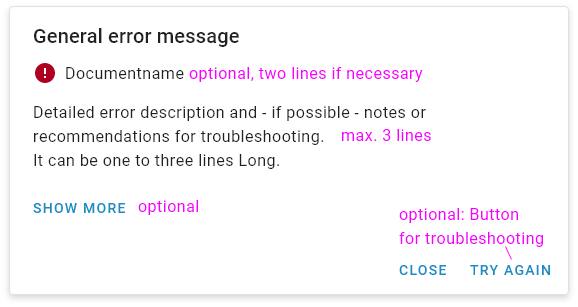
- General error dialog:
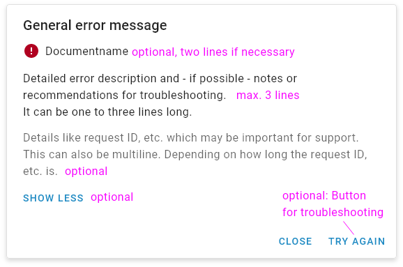
- General error dialog with "show more":
- Example error dialog:
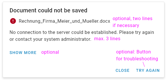
- Example error dialog with "show more":
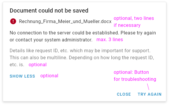
Title
The title should be formulated as a negated original function (e.g. "Document could not be saved" instead of "Error").
Specification of the erroneous elements (optional)
This specification is optional. It can be one or two lines. If the maximum number of lines is exceeded, the text is dotted. The material icon "Error" (#ffffff on #b00020) is followed by the specification of the erroneous element.
Short description
Detailed error description and - if possible - notes or recommendations for troubleshooting. It can be one to three lines long. If the maximum number of lines is exceeded, the text is dotted.
Details specification (optional)
This specification is optional. With the help of a "Show more" button, the user can call up further details. These are details that can be important for support, such as the request ID.
Action (partly optional)
A close action must always be offered. In addition, there can be an optional button for troubleshooting.
1b) Mobile: An error occurs with ONE element (e.g. a document)
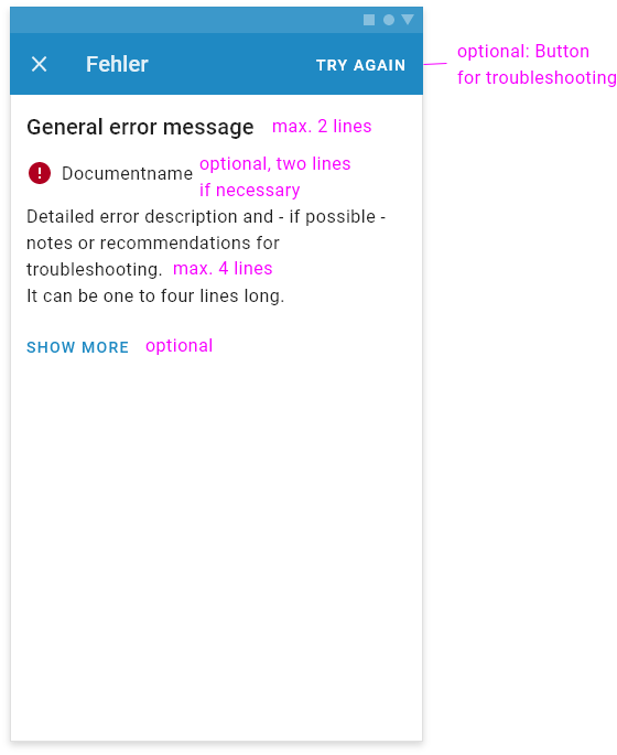
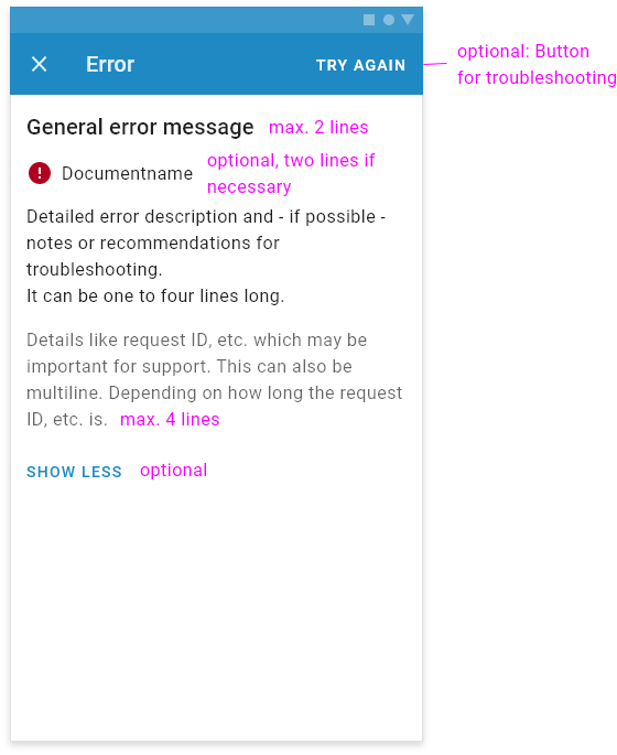
In the mobile variant, the error dialog is displayed as a fullscreen dialog.
- General error dialog:
- General error dialog with "Show more":
Title
The title should be formulated as a negated original function (e.g. "Document could not be saved" instead of "Error").
Specification of the erroneous elements (optional)
This specification is optional. It can be one or two lines. If the maximum number of lines is exceeded, the text is dotted. The material icon "Error" (#ffffff on #b00020) is followed by the specification of the erroneous element.
Short description
Detailed error description and - if possible - notes or recommendations for troubleshooting. It can be one to four lines long. If the maximum number of lines is exceeded, the text is dotted.
Details specification (optional)
This specification is optional. With the help of a "Show more" button, the user can call up further details. These are details that can be important for support, such as the request ID.
Action (partly optional)
A close action must always be offered (with the material icon "Close" in the TopAppBar on the left side). In addition, there can be an optional button for troubleshooting (in the TopAppBar on the right side).
2a) Desktop or tablet: The same error occurs with several elements (e.g. several documents)
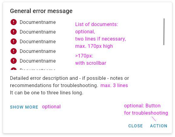
- General error dialog:
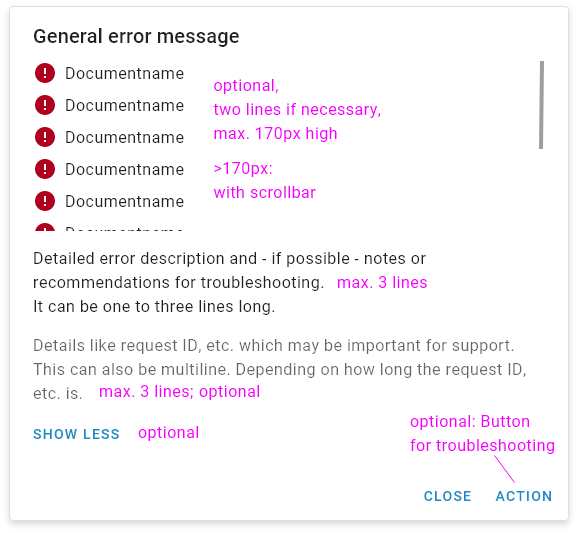
- General error dialog with "Show more":
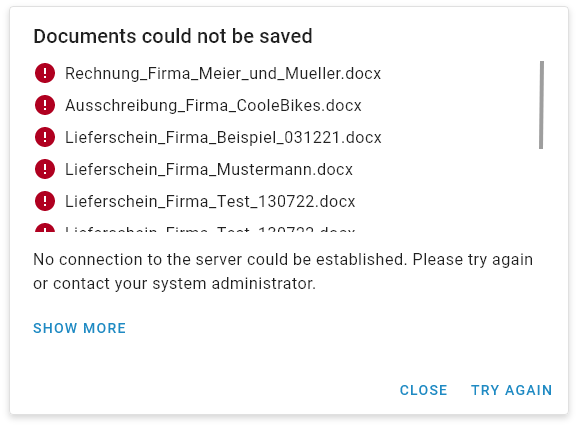
- Example error dialog:
- Example error dialog with "Show more":
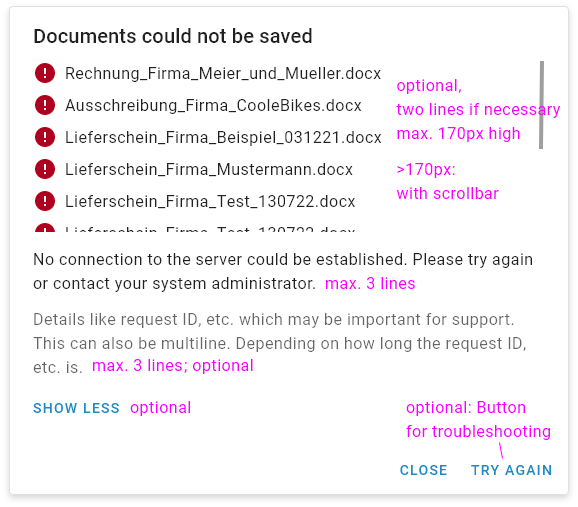
Title
The title should be formulated as a negated original function (e.g. "Document could not be saved" instead of "Error").
Specification of the erroneous elements (optional)
This specification is optional. The erroneous elements are displayed with the help of a list. A list element can have one or two lines. If the maximum number of lines is exceeded, the text is dotted. A list element consists of the material icon "Error" (#ffffff on #b00020) and the specification of the erroneous element. The list can be max. 170px high. If there are more elements, a scrollbar appears for this area.
Short description
Detailed error description and - if possible - notes or recommendations for troubleshooting. It can be one to three lines long. If the maximum number of lines is exceeded, the text is dotted.
Details specification (optional)
This specification is optional. With the help of a "Show more" button, the user can call up further details. These are details that can be important for support, such as the request ID.
Action (Partly optional)
A close action must always be offered. In addition, there can be an optional button for troubleshooting.
2b) Mobile: The same error occurs with several elements (e.g. several documents)
In the mobile variant, the error dialog is displayed as a fullscreen dialog.
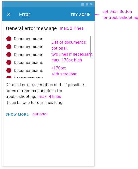
- General error dialog:
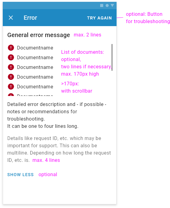
- General error dialog with "Show more":
Title
The title should be formulated as a negated original function (e.g. "Document could not be saved" instead of "Error"). It can be one or two lines.
Specification of the erroneous elements (optional)
This specification is optional. The erroneous elements are displayed with the help of a list. A list element can have one or two lines. If the maximum number of lines is exceeded, the text is dotted. A list element consists of the material icon "Error" (#ffffff on #b00020) and the specification of the erroneous element. The list can be max. 170px high. If there are more elements, a scrollbar appears for this area.
Short description
Detailed error description and - if possible - notes or recommendations for troubleshooting. It can be one to four lines long. If the maximum number of lines is exceeded, the text is dotted.
Details specification (optional)
This specification is optional. With the help of a "Show more" button, the user can call up further details. These are details that can be important for support, such as the request ID.
Action (Partly optional)
A close action must always be offered (with the material icon "Close" in the TopAppBar on the left side). In addition, there can be an optional button for troubleshooting (in the TopAppBar on the right side).
3a) Desktop or tablet: Different errors occur for several elements (e.g. several documents)
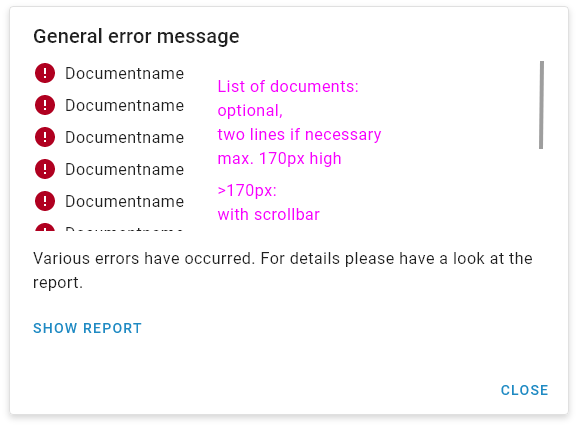
- General error dialog:
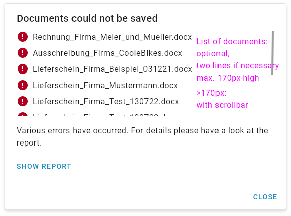
- Example error dialog:
Title
The title should be formulated as a negated original function (e.g. "Document could not be saved" instead of "Error").
Specification of the erroneous elements (optional)
This specification is optional. The erroneous elements are displayed with the help of a list. A list element can have one or two lines. If the maximum number of lines is exceeded, the text is dotted. A list element consists of the material icon "Error" (#ffffff on #b00020) and/or the material icon "Warning" (#ffffff on #ffcb31) and the indication of the erroneous element. The list can be max. 170px high. If there are more elements, a scrollbar will appear for this area.
Short description
Text: "Various errors have occurred. For details please have a look at the report."
Jump to the report
With the help of the button "Show report" the user can open the error report. There the erroneous elements - grouped by error message - can be displayed. This should NOT open in a dialog.
Action (Partly optional)
A close action must always be offered.
3b) Mobile: Different errors occur for several elements (e.g. several documents)
In the mobile variant, the error dialog is displayed as a fullscreen dialog.
- General error dialog:
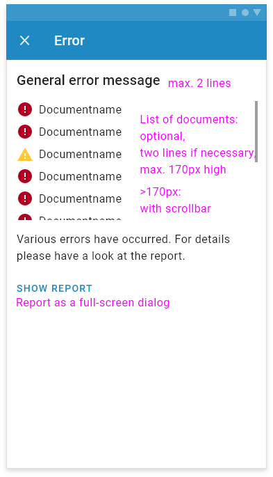
Title
The title should be formulated as a negated original function (e.g. "Document could not be saved" instead of "Error"). It can be one or two lines.
Specification of the erroneous elements (optional)
This specification is optional. The erroneous elements are displayed with the help of a list. A list element can have one or two lines. If the maximum number of lines is exceeded, the text is dotted. A list element consists of the material icon "Error" (#ffffff on #b00020) and/or the material icon "Warning" (#ffffff on #ffcb31) and the indication of the erroneous element. The list can be max. 170px high. If there are more elements, a scrollbar will appear for this area.
Short description
Text: "Various errors have occurred. For details please have a look at the report."
Jump to the report
With the help of the button "Show report" the user can open the error report. There the erroneous elements - grouped by error message - can be displayed. This should open in a fullscreen dialog.
Action
A close action must always be offered (with the material icon "Close" in the TopAppBar on the left side).
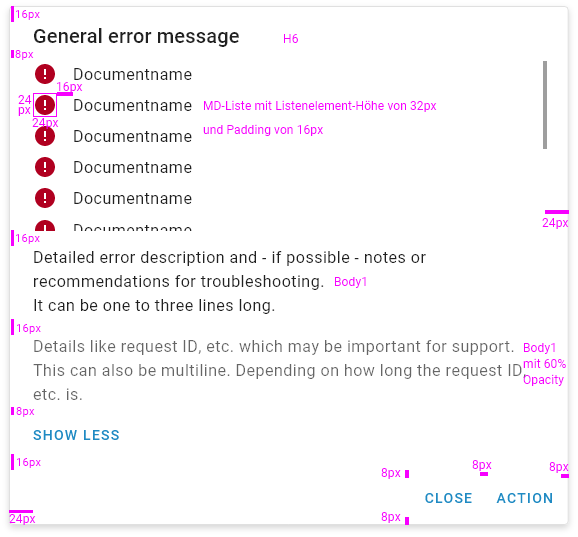
Specification
- Spacing
Links
You can find further content on the following pages of the design system.
Configuration Page - Guidelines for designing
Use Case
If a configuration is required for an application, a configuration page must be created.
Explanations
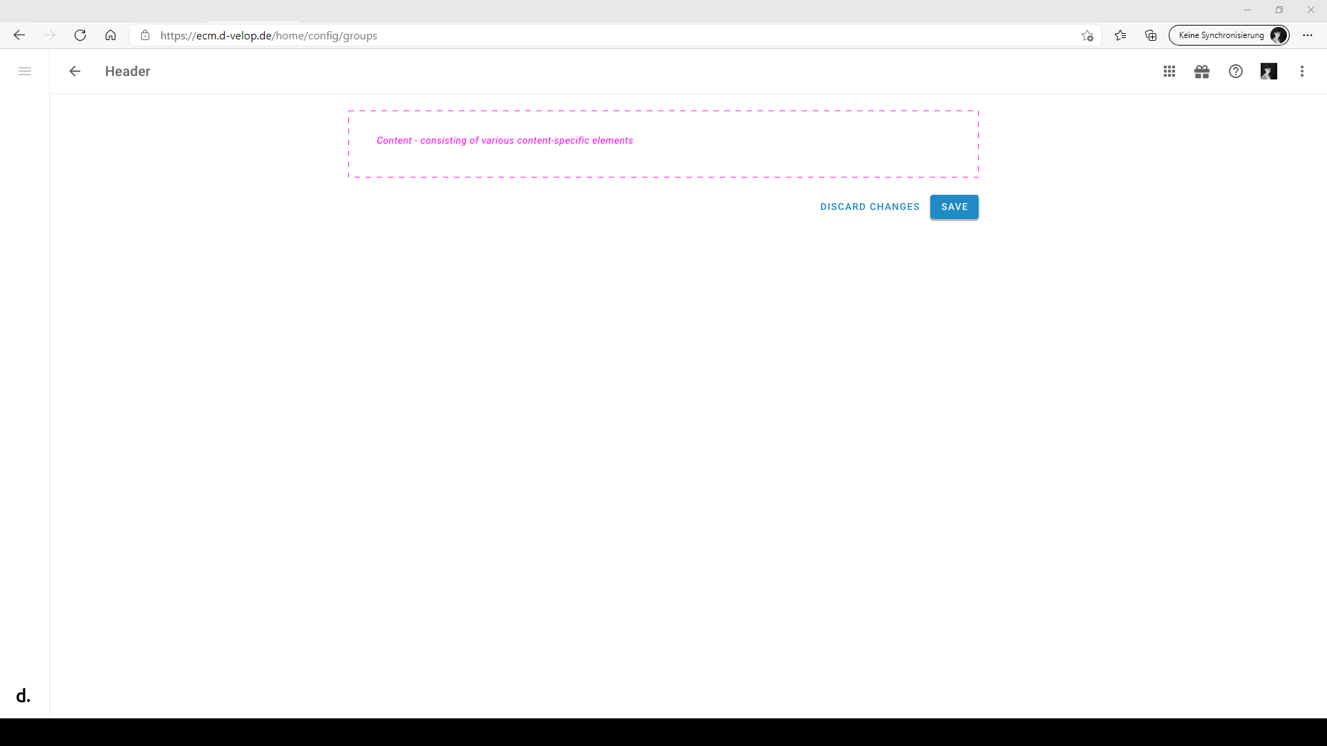
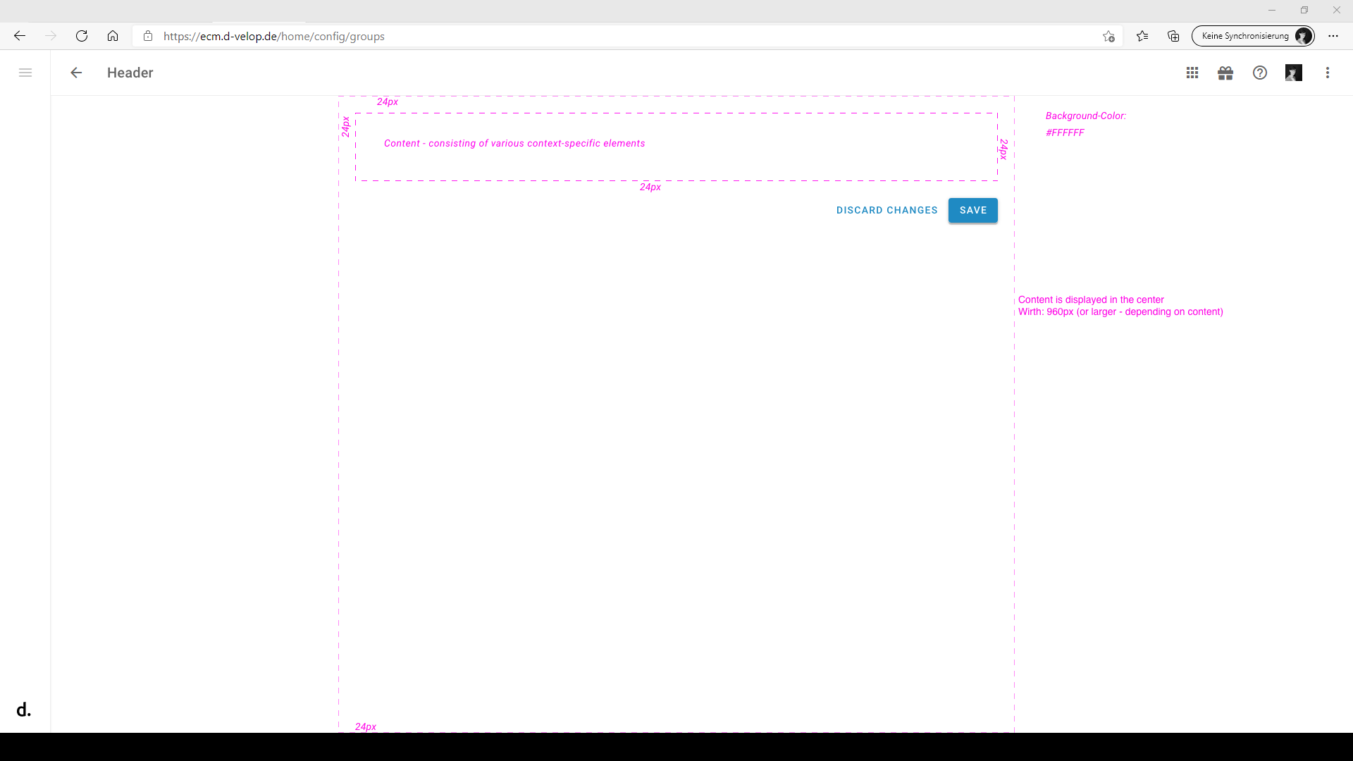
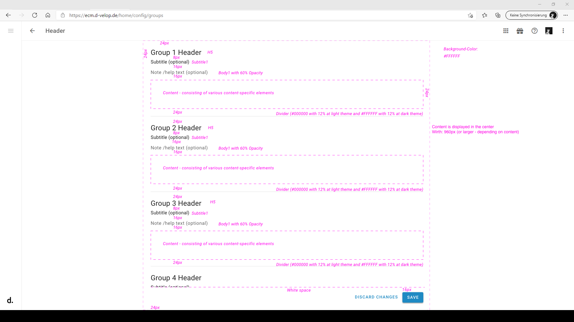
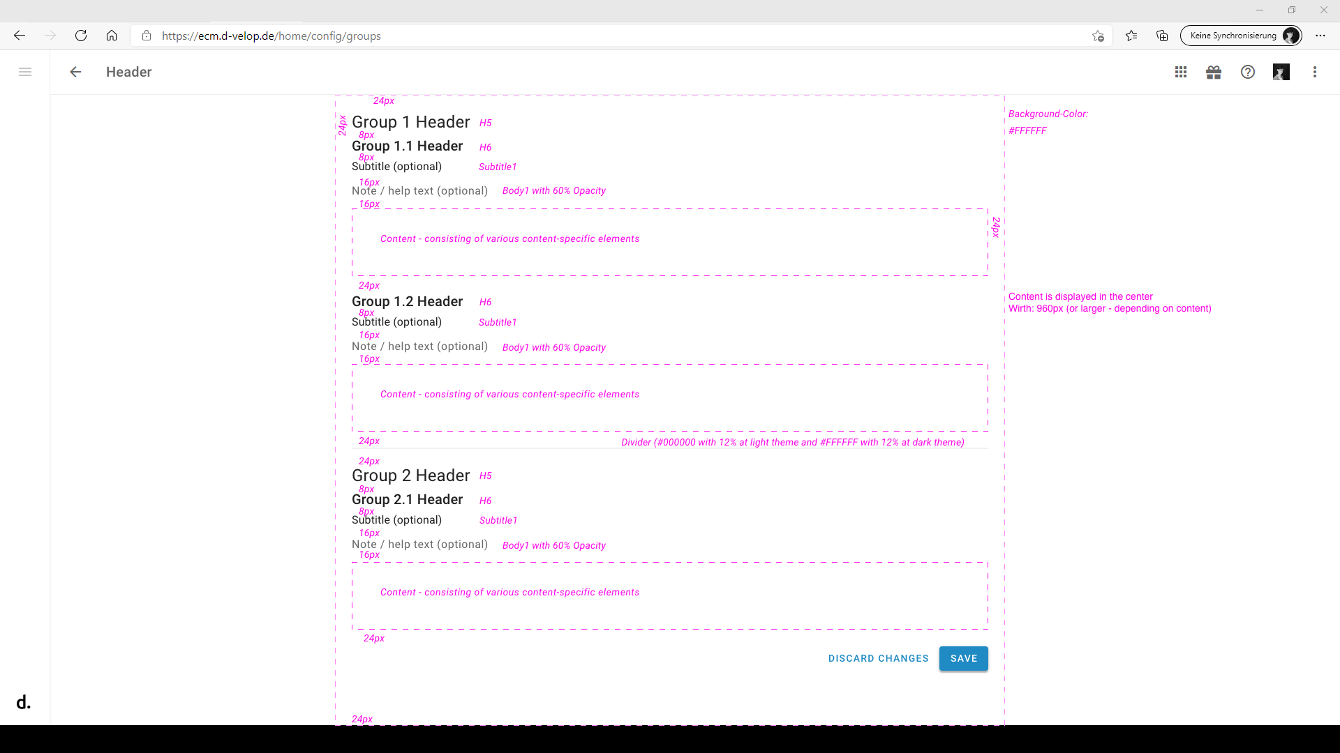
The content should be centered and should have a width of >= 960px - depending on the content. A margin of 24px should be there.
Besonderheiten
Basically, we distinguish two types:
Configuration page without grouping elements
- Content
- Consisting of various context-specific elements
- Material.io
- Buttons
- Should be positioned at the bottom right, directly below the content or at the bottom of the screen
- Always visible (even when scrolling)
- Save-Button
- Contained-Button
- Reset-Button (optional)
- Resets changes to the original state
- Text-Button
- If there are already icons in the toolbar, then the Save-Button can be placed in the toolbar additionally
- In exceptional cases (if the complexity allows it) the buttons can be omitted
- Example
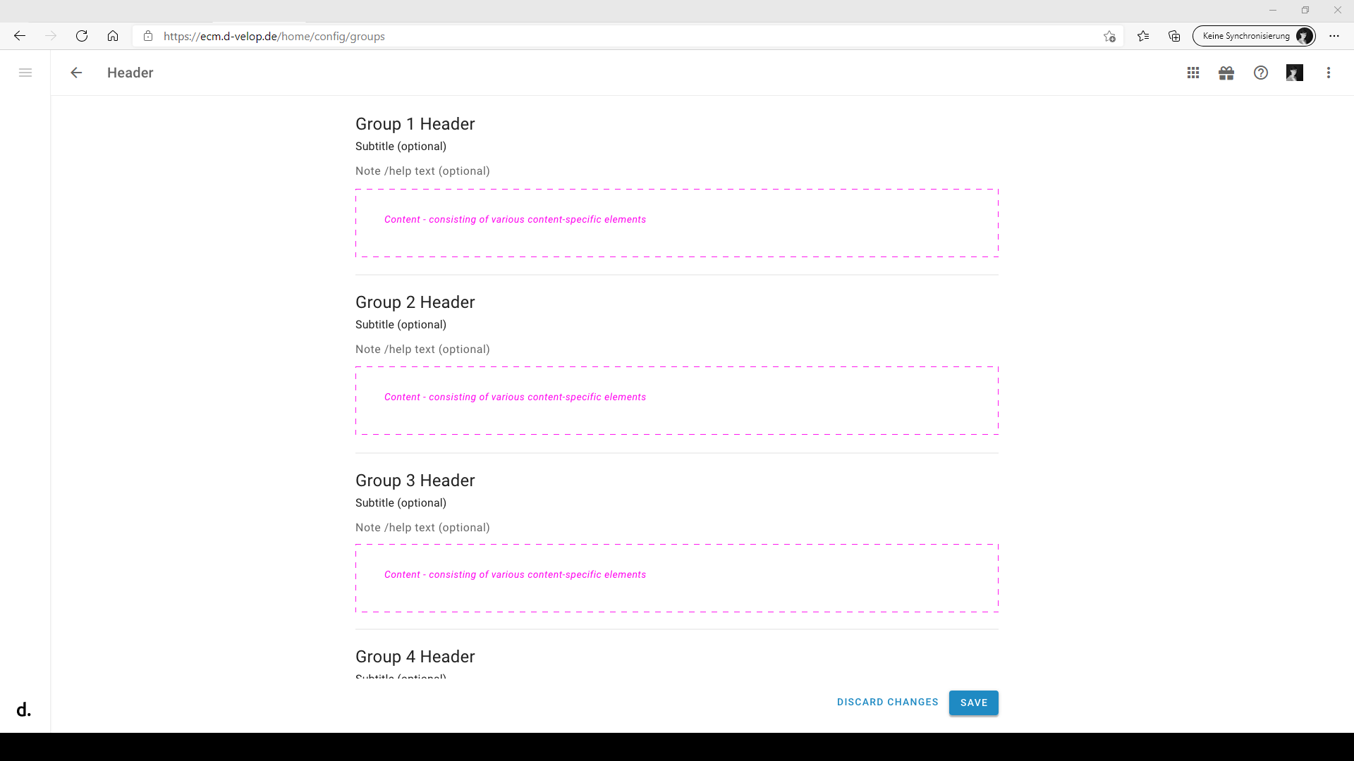
Configuration page with grouping elements
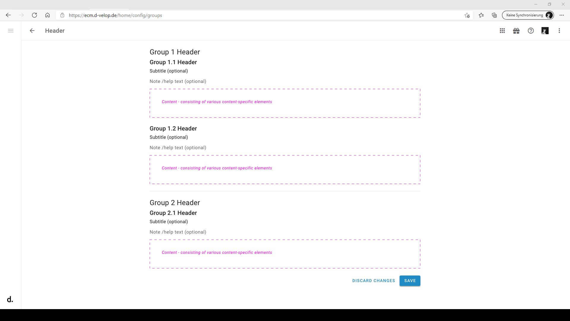
- With header per group
- H5
- If you need another subordinate hierarchy level, the header H6 can be used additionally (optional)
- Subtitle (optional)
- Subtitle1
- Note / Help text (optional)
- Body1 with 60% opacity
- Attention: If a high-contrast theme is used, Body1 with 87% opacity should be used
- Content
- Consisting of various context-specific elements
- Material.io
- Divider
- For separation of the groups
- Material.io
- Buttons
- Should be positioned at the bottom right, directly below the content or at the bottom of the screen
- Always visible (even when scrolling)
- Save-Button
- Globally available
- Contained-Button
- Reset-Button (optional)
- Resets changes to the original state
- Can be available per group and/or globally
- Text-Button
- If there are already icons in the toolbar, then the Save-Button can be placed in the toolbar additionally
- Example
- Example with additional hierarchy level
Links
You can find further content on the following pages of the design system.
Search - Addition to the expandable search
Use Case
The concept of the expandable search should be used especially if the search is not the most important part of the app. With the expandable search, only a search symbol (magnifying glass) is displayed in the toolbar instead of an open search text field.
Explanations
The user always had to confirm his input with ENTER until the corresponding results were displayed. Especially in combination with a simple filter option for visible results, the following confirmation of the ENTER key was a little complicated. In this case, the feedback during input also serves as a valuable prediction of upcoming entries.
Particularity
In contrast to the material description, it can be decided individually along the present use case whether the search mechanism is typically already triggered during the input of individual characters, or actually only after confirmation of the ENTER key.
Caution
If text suggestions or historical search terms are planned to be displayed within the expandable search, you should wait until the user has been submitted or selected te relevant item.
Helpful Links
You can find more information about this on the following pages of the Design System.
Missing Icons and Symbols
Use Case
An icon is required that is not within the scope of the symbols provided by the design system. How to deal with missing icons in general, for which there is no alternative neither in material nor in e.g. FontAwesome?
Explanations
Material already offers a large number of different symbols for free use. Although new symbols are added continuously, they are largely limited to the typical symbols of the digital world (media, web, content, etc.).
Symbolism is very important, because people can recognize images faster than text. Icons should also always be very close to already known picture-language ( e.g. diskette for saving ), or create an analogy to the real world ( e.g. pencil for editing ). By the repetition and/or the recurring patterns an application is felt by the user as particularly intuitive.
The material icons are offered in different style variations (Filled, Outlined, Rounded, Two-Tone and Sharp). Filled is the preferred variant.
Particularity
With d.velop Icon Font, which has already been used in the DUX, we have found a way to integrate individual symbols as needed. Those symbols, which are particularly necessary in the ECM context (e.g. dossier symbol), will be provided over the same way. It is absolutely necessary to create the icons according to the principles of the design system.
Caution
If further individual libraries are used outside of the material icons or the d.velop Icon Font, an appropriate licensing is required.
Helpful Links
You can find more information about this on the following pages of the Design System.
Illustrations
Use Case
Illustrations in our interfaces should help to emotionalize and entertain the user. This can often make up for minor errors, unavoidable technical circumstances or long waiting times.
Explanations
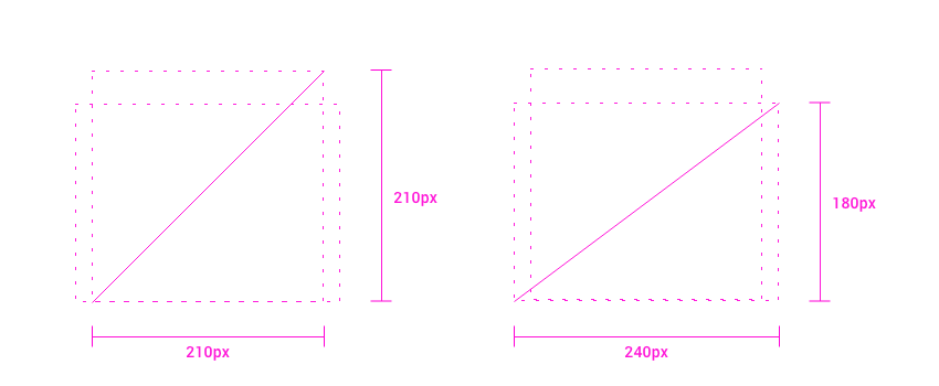
The illustrations are delivered as PNGs in 3 different dimensions (sm=160px, md=240px and lg=320px). For square dimensions, the sm variant is reduced to 100px. These specifications should not be exceeded in height or width (landscape illustrations). As a rule, the size of the image is aligned with the display size/device. In addition, the corresponding SVG file is provided.
General structure
- The structure of the dialogs is based on the resolution of a mobile device (320px x 568px).
- The illustration is placed with its bottom edge on the horizontal center axis
- The maximum width of the illustration is 240px
Dimensions and spacing
Illustrations should be landscape or square at size maximum.
| Property | max. size |
|---|---|
| Width | 240px |
| Height | 210px |
| Circumferential | 420px (min. 400px) |
Particularity
When using illustrations, the following issues should be kept in mind:
- Keep correct proportions
- Use standard theming colors
- Avoid detailed or playful illustrations
Caution
Illustrations should be used sparingly and judiciously. Our software is not meant to be a flip book.
Overview
| Preview | Download | Notes |
|---|---|---|
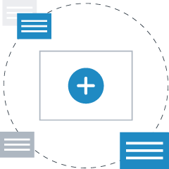 | create-new.zip | Der Nutzer kann etwas "Neues" anlegen oder erzeugen |
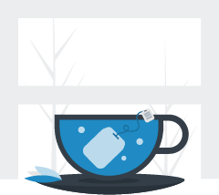 | waiting.zip | Der Nutzer muss länger warten, während ein Vorgang läuft |
 | records.zip | Ein Dokument wird in einer Akte gespeichert hochgeladen |
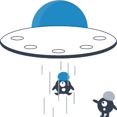 | gone.zip | Eine App, eine Seite oder ein Widget wurde deinstalliert bzw. entfernt (nicht mehr auffindbar) |
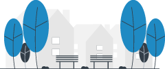 | empty.zip | Es sind (noch) keine Inhalte verfügbar |
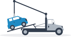 | error.zip | Ein Fehler ist aufgetreten (dem Nutzer kann aber geholfen werden) |
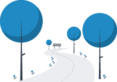 | no-results.zip | Es gibt zwar Inhalte, nur werden aufgrund der durch den Nutzer bestimmten Einschränkungen keine angezeigt |
 | success.zip | Etwas ist geglückt oder eine Operation konnte erfolgreich abgeschlossen werden |
 | not-found.zip | Eine Ressource wurde nicht gefunden. Mehr als nur ein bloßes "Empty" (404-Error) |
Helpful Links
You can find more information about this on the following pages of the Design System.
Empty state - Addition to display
Use Case
It can happen that a list does not contain any elements, or that a search does not return any results and an empty area is displayed to the user.
Explanations
In particular, if non-typical states occur during certain usage situations, the advices or dialogues for this should be designed in such a way that they make the unfamiliar state clear to the user. The hints should have more of the charm of a friendly advice rather than an error-like character.
Particularity
There are 4 essential elements for displaying an empty state.
Picture or illustration (optional)
An image that fits the situation. Icons should not be used for this purpose, otherwise the user might mistake it as an action.
Title
A heading that is helpful from the user's perspective and clearly describes the purpose of the current screen.
Short description
Additional information and recommendations for changing or avoiding the empty state.
Action (optional)
If the actual capabilities of the application can only be made accessible to the user in conjunction with corresponding content, an action can be offered. The action should assist the user in understanding what the application is designed for and what content is required (e.g. add pages).
Helpful Links
You can find more information about this on the following pages of the Design System.
Frequently Asked Questions
What is a design system?
A design system describes a collection of reusable components that are based on precise design rules. In the future, we not only want to use reusable components to reduce costs and increase speed, but also to scale design decisions.
Why Material Design
Google's design system covers a wide range of design guidelines and also offers an extensive component catalogue. For example, Google provides Authoring Guidelines for implementing and deploying your own components.
Material Design is not bound to any special Javascript environment, such as Angular or React, and can therefore be used framework-independently. An adapter concept enables the framework-related use of the system or its individual components. Due to its universal character, Google's design system can be used in many ways and is particularly adaptable due to the integrated Theming mechanisms.
Material Design also offers helpful tools, such as the theme editor, icons or a UI Kit, which support both designers and development teams during their daily work.
Where can I find details about Material Design?
Relevant information can be found under material.io. The page essentially covers three areas where details on semantics, technical basics and associated tools are listed.
Supports material design accessibility
In addition to many technical and visual adaptations (e.g. Theming), Material Design also makes it possible to create prerequisites for accessibility and bidirectional work (Left-To-Right and thgiR-oT-tfeL). And to make the applications usable for people with different abilities. Further details are available here.
How is Material Design licensed?
The Design System is available as Open Source under Apache License 2.0.
What are design debts?
As applications grow, more and more individual design decisions are made. Debts result from the many inconsistent and non-reusable conventions. A systematic approach makes design debts controllable.
Does the systematic approach have a detrimental effect on one's own creativity?
No, instead of further design debts on the basis of custom-made new, creative approaches can even flow back. Everyone can benefit equally from additions or extensions to the system.
What's the BEM syntax?
Material Design Components (MDC) follow the so called BEM-Standard (Block, Element, Modifier) within their styling assets to create more transparency within their styling classes and DOM elements.
Recommended framework wrappers
In addition to the standard implementation of HTML, CSS and JS, there are adapters for different frameworks for the Material Components, such as React or Angular.
We recommend the use of the following adapter implementations.
React
Google itself has maintained a own React branch since the end of 2018.
Angular
Miscellaneous
Github Repositories
- Material Components Android
- Material Components iOS
- Material Components Web
- Material Components Flutter